
Colours, mixtures, how to make a painting come to live?
How to paint a beautiful painting?
This is the question I hardly ever hear.
During my exhibitions, I often hear the same comment repeatedly: “I don’t know much about art, but I find this painting very beautiful.” As if art enthusiasts didn’t have the right to appreciate a painting according to their taste simply because they didn’t attend art school.
Even after all these years, I am still surprised. Whether you are “knowledgeable” about art or not, it’s the feeling that matters! To stay in analogies, you don’t need to know how to play the piano to enjoy music.
Certainly, there is nothing more subjective than art, but there are still codes. You can master technique, work with the perfect tools, if these codes are not respected, well, your work won’t speak. It won’t resonate with the viewer and won’t trigger the heartwarming feeling every aspiring artist dreams of. And these codes begin with mastering colors.
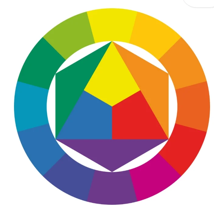
A- The colour wheel

The colour wheel illustrates light broken down through a prism. It is exactly this phenomenon of light being broken up by raindrops that we observe when a rainbow is formed.
Did you know that? A rainbow, seen from the sky, is no longer shaped like a bow, but like a circle! Because we are looking at the horizon, we can only see part of the circle.
Light is therefore made up of many different colours.
This set of 12 colours forms the traditional colour circle to which most artists still refer. It is also commercially available as the Itten circle, named after its inventor, Johannes Itten, an art teacher in the 19th century.
There are however 3 primary colours:
– red,
– blue,
– and yellow,
They are called “primary” because they cannot be made from other colours.
They are distributed equidistantly on the colour wheel by dividing it into 3 parts,
If you mix two primary colours, you get a secondary colour, which will then be inserted in the centre of one of the 3 parts.
For example, red and yellow mixed in equal parts will give orange. This new colour, orange, is equidistant between red and yellow on the colour wheel.
Mix red with blue, and you get purple, which is equidistant from red and blue,
Mix blue with yellow and you get green, which is also equidistant from the two colours that make it up.
In summary, 3 secondary colours:
– red + yellow = orange
– red + blue = purple
– Yellow + blue = green
B- the complementary ones
Knowing the colours and their interactions is essential in art. The notion of complementarity is fundamental. It is the keystone of a successful work.
In contrast to the colours they complement on the colour wheel, complementary colours are used to :
– highlight a subject.
– neutralise a colour.
If this sounds complicated, I have a tip: you can of course learn them by heart, but in reality you just have to keep in mind that a colour has as its complementary the primaries that do not compose it!
To sum up:
– complementary of red = blue + yellow (green)
– complementary of blue = yellow + red (orange)
– complementary of yellow = red + blue (violet) and vice versa!
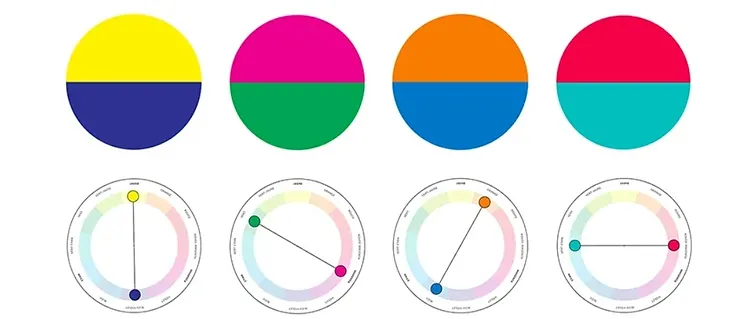
Finally, you should know that mixing two complementary colours will give you the ultimate neutral colour: grey!
And knowing this is not neutral, because it is what will allow you to transcend your paintings!
Indeed, rather than trying to apply grey, which will dull your work, to make the shadows, use the complementary colours intelligently!
For example, you have painted a cityscape, and your buildings are orange. So add some blue to your mix to represent your own shadows! The grey this gives you will transcend your building (whereas dulling it with grey will extinguish it)
In the same way, if the green of your foliage seems too green, add a little red to it, it will desaturate your green, and give it more credibility!
Finally, as I said earlier, complementary colours are also great for highlighting a subject and making it stand out. Does your work contain a large amount of purple? Go for a yellow background! You’ll see, it changes everything!
C- Going further
I spoke to you about primary colours, which are based on academic teachings recognised since the Renaissance, but today, the diversity of pigments has evolved so much since that time, that these fundamentals are largely questioned. Indeed, the primary blues and reds found in distribution today are based on pigments available in the 15th and 16th centuries. However, these pigments have their limits, and do not make it possible to obtain all the colours, in particular violet, which turns very quickly to brown, with the blue and red primaries that our ancestors used.
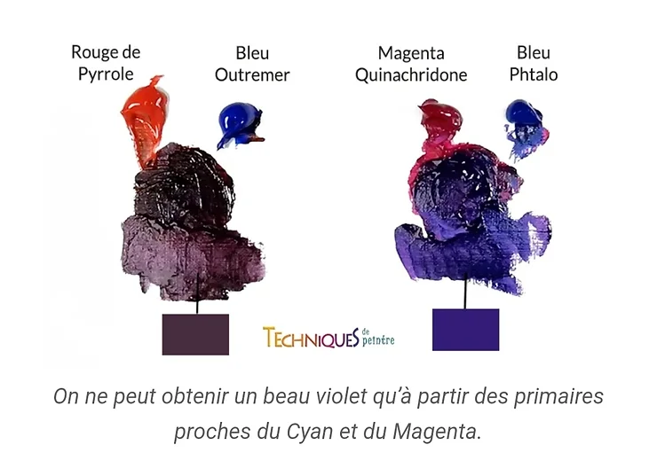
Printers have understood this and have adapted this theory by moving the cursor slightly towards more saturated pigments. This is why today we find in our printers the pigments Cyan (blue), Magenta (red) and yellow, as a primary.
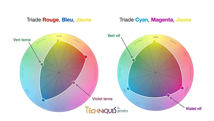
I would therefore advise you to adapt your palette and to acquire these essential colours as soon as possible if you don’t already have them.
I hope that this article will help you to see more clearly the use and the utility of colours. Don’t hesitate to ask questions, comment, and above all, to like! It doesn’t cost anything, but it feels so good!
Thanks to all of you!